Eclectic Domestic Spaces and Thick Letters
We recently viewed a small but excellent show on Robert Indiana at the Farnsworth Art Museum in Rockland, Maine and took away a few lessons. The first was a confirmation that artists create the coolest domestic environments for themselves. Indiana spends the summer in Vinalhaven, a relatively remote island in the middle of Penobscot Bay (and adjacent to North Haven, summer-time haunt of our very own Matthew Littell and Toshiko Mori and Jamie Carpenter, New York’s favorite architect-couple).
Indiana bought his building, a former Odd Fellows Lodge on Vinalhaven’s main street back in the late 70s when the purchasing power of artists was in alignment with the price point of historic urban real estate with big open spaces. The show includes a video of Indiana in his house and few large format photographs of the interior, scenes that look like they are out of the pages of the World of Interiors, an excellent British publication focused on off-beat and idiosyncratic domestic interiors, both historic and contemporary.
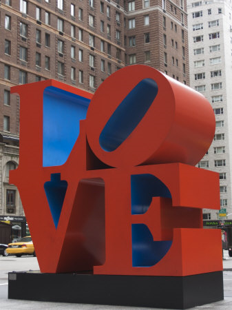
The second lesson was provoked by recent discussions in the office about cross-disciplinary and multi-disciplinary design practices. Many of Indiana’s pieces in the Farnsworth show riff off of his iconic Love sculpture/graphic of the mid-1960s; a moment when his experimentation of letter forms as a subject of painting hit its stride. Perhaps it took someone outside of the discipline of graphic design to conceive of letterforms with depth that almost equals the front (and legible) face that allows us to “read” a letter to make words. Indiana, through this thickening, was also able to literalize a graphic designer’s interest to make shapes out of the white space of the page and the leftover bits between letterforms. Certainly, graphic designers had thought about these issues before, whether as commercial sign-makers or the professionally self-conscious version of the discipline that emerged in America and Europe after World War II (Saul Bass comes to mind, but more than a dozen innovators fit the bill). Perhaps Indiana could conceive of the Love sculpture precisely because he wasn’t a graphic designer. Or more accurately, because he wasn’t a graphic designer, painter, or sculptor (strictly speaking).
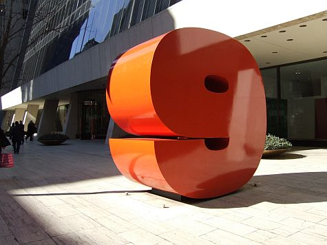
Interestingly, Ivan Chermayeff’s No. 9 in front of 9 West 57th Street in New York (1974), benefits from the strategic lessons of the Indiana pieces. In one way Chermayeff’s giant number is less interesting than Love because the inside edges of the nine are the same color and texture as the face, but more sculptural because the fat and almost-sagging shape seems to respond to the forces of gravity and Gordon Bunshaft’s threatening sloped plane above.
-Tim