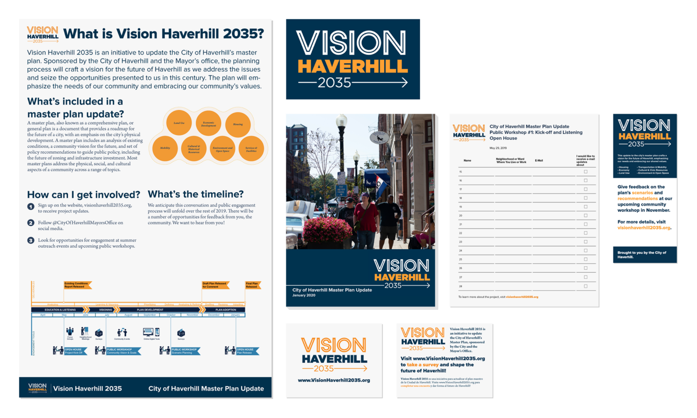
Visual Branding
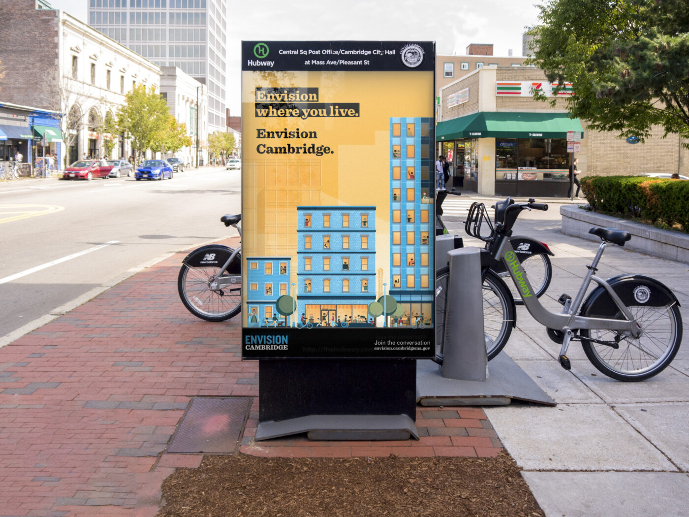
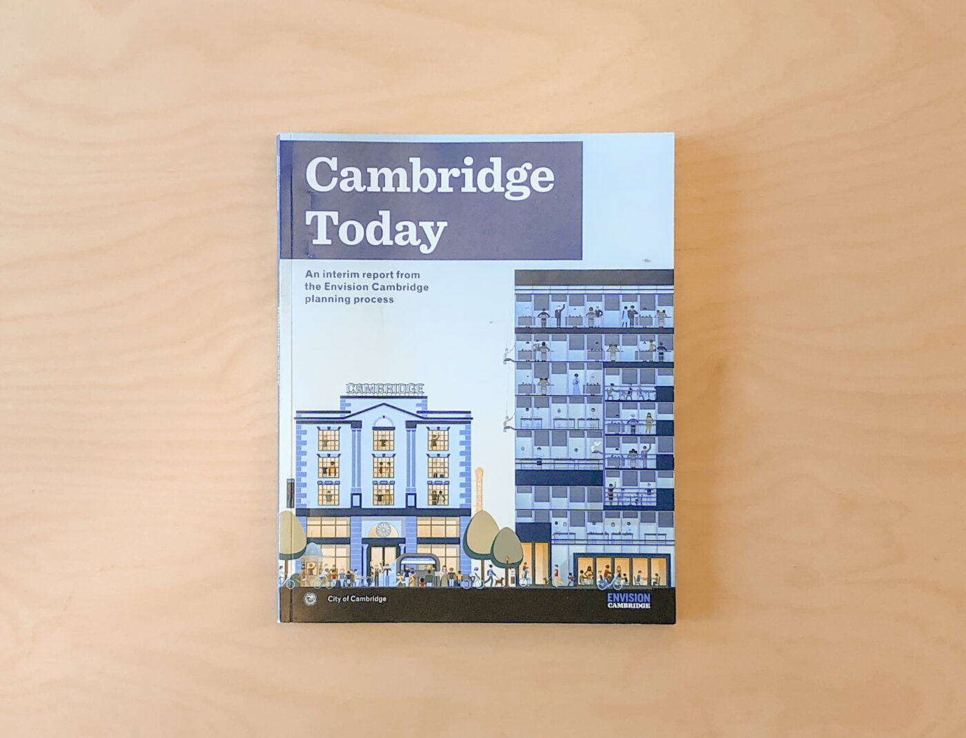
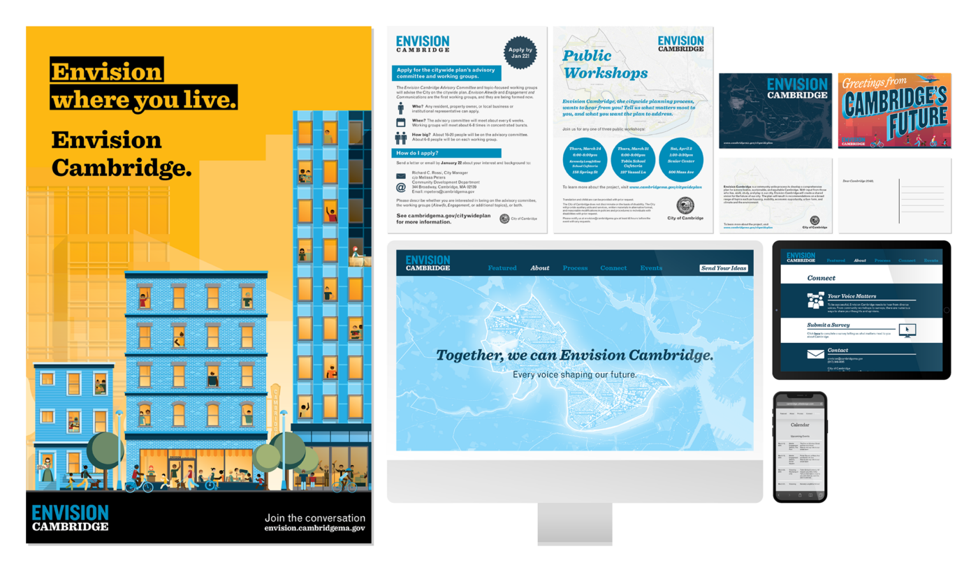
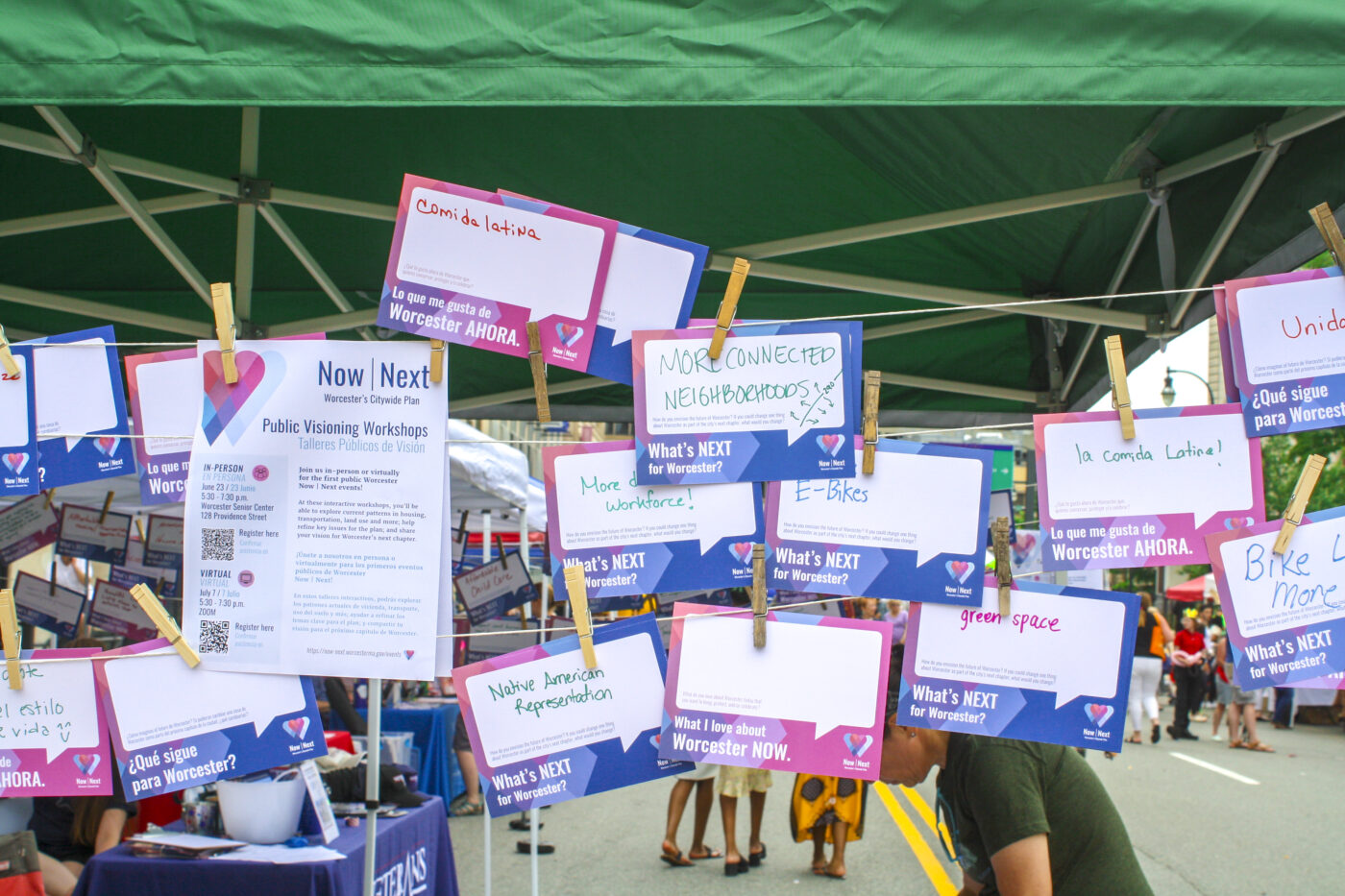
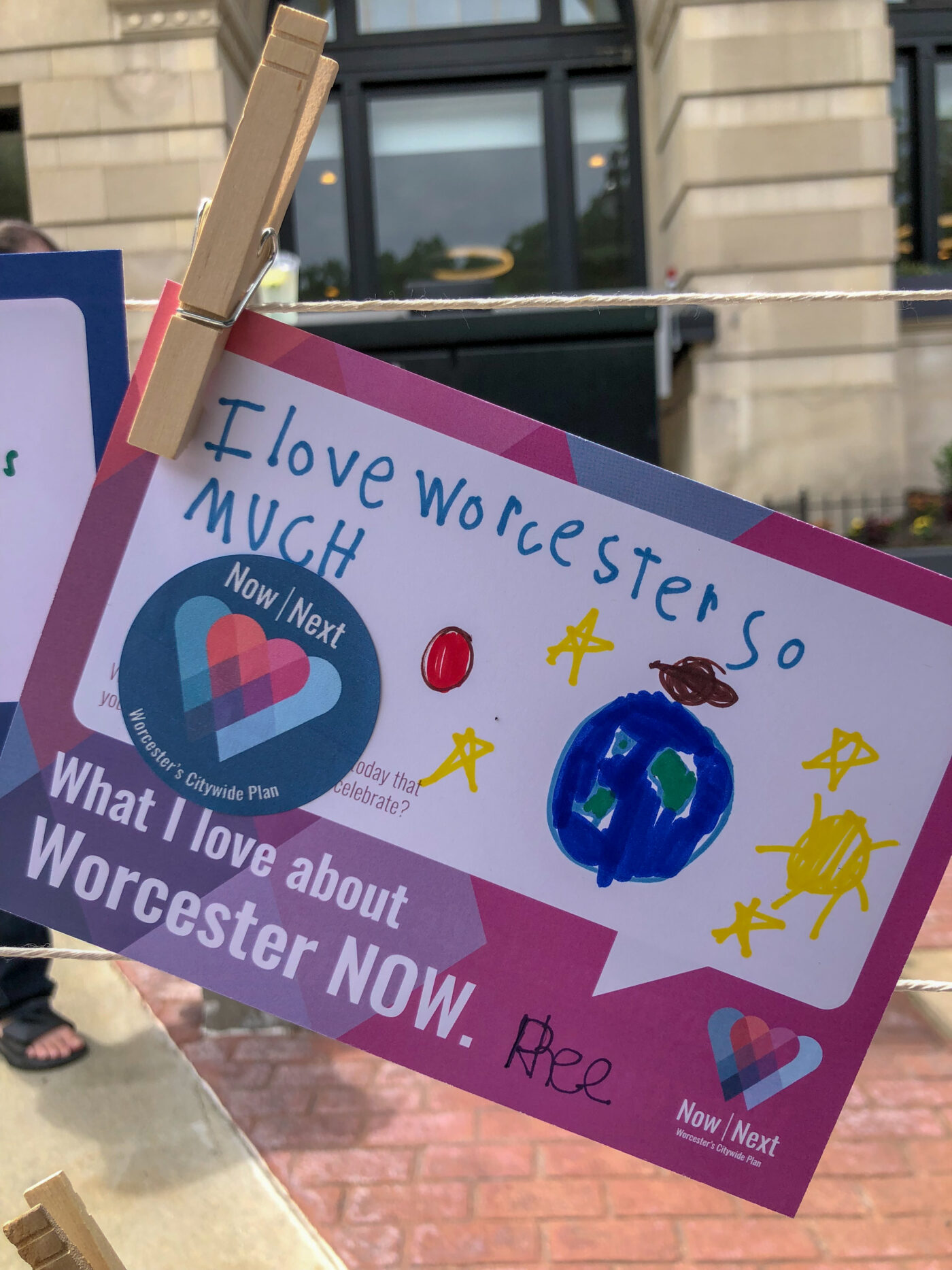
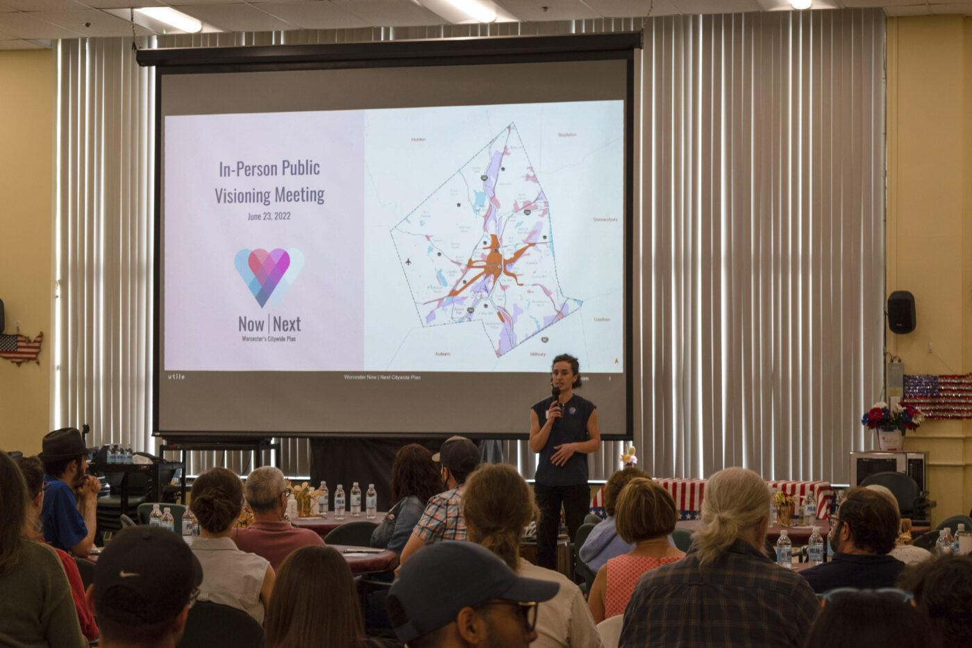
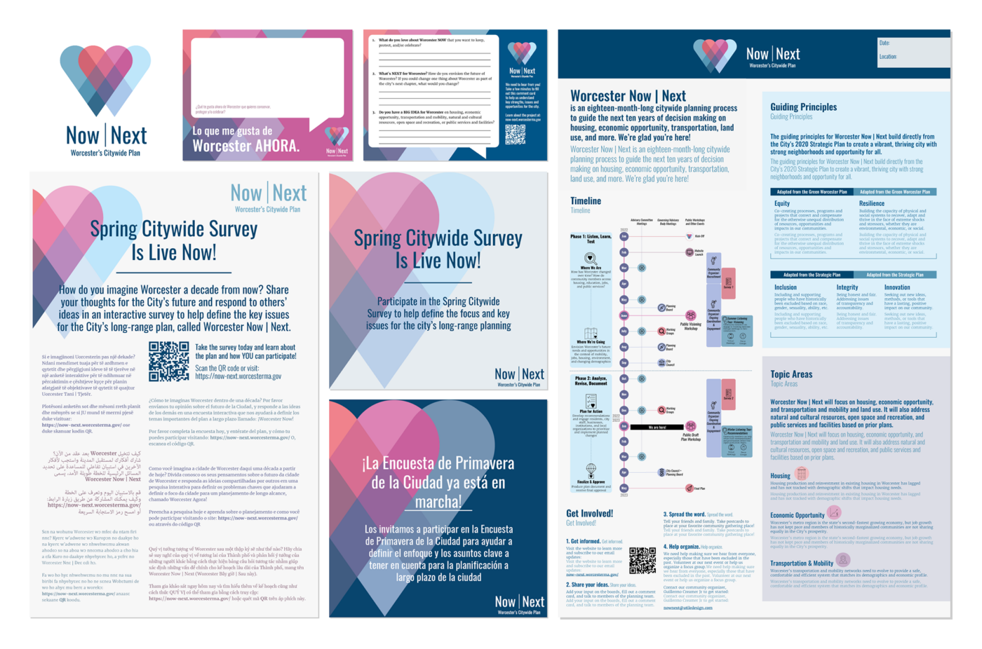
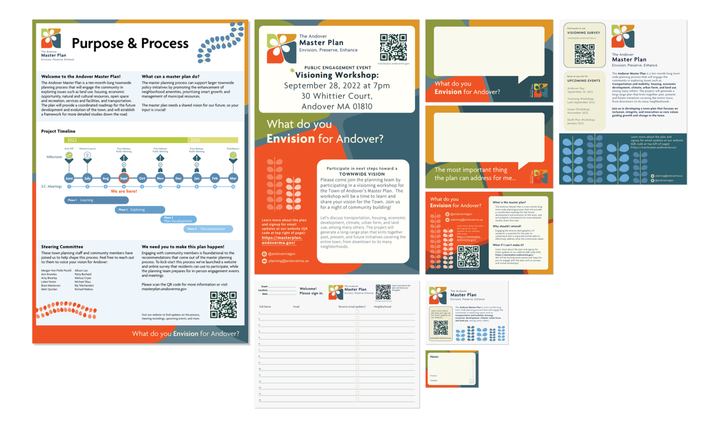
As part of Utile’s expertise in urban planning and community engagement, we develop visual brands to link the project identities to the locales within which we work and differentiate our projects from other planning efforts in the surrounding regions. By alluding to, but not copying, existing place-specific imagery, colors, and associations, we are able to develop brand identities that are recognizable to locals with fresh, new twists. Whether deployed on reports, websites, mailers, or social media, Utile strives to deliver consistent brand identities across all aspects of our projects. Our past branding work has included an awareness campaign for the City of Cambridge’s citywide plan that incorporated Easter eggs of notable Cantabrigian both past and present, a heart motif logo and branding Worcester, the “Heart of the Commonwealth,” and an identity for the Town of Andover inspired by the form of I-93 and I-495 crossing over the town.
